MillerCoors announced in a blog post on Dec. 5 that Molson Canadian — Molson's flagship brand — is getting a new look this month for the US market.
The company said it has updated the packaging for Molson Canadian to match the packaging launched in Canada a year ago, rolling out the new look to 10 states in December and continuing a soft transition over the next few months.
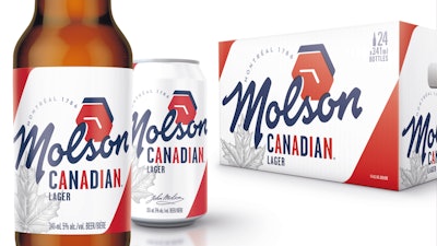
In the US, the Canadian lager brand's new cans, bottles and cardboard packs don white, red and blue coloring and feature the Molson name in a font formerly used by the company. The packaging/labeling refresh also includes historical elements like the company's founding location and year — Montreal, 1786 — founder John Molson's signature and a graphic depicting the hexagonal clock on the brand's landmark Montreal brewery.
Molson's marketing said the refresh "aims to root the brand in its rich heritage and restore equity to the Molson name, while streamlining its look across the US and Canada.
“As we look to the future, we wanted a more cohesive look across variants, which gives us brand blocking on shelves and power in numbers," said Alex Sponga, Molson marketing manager. "Our focus in the US is to make sure our visual identity is consistent. Considering the bulk of our volume is sold so close to our shared border, we want to ensure drinkers have the same branded experience whether they’re at a (Buffalo) Bills game or a (Toronto Maple) Leafs game.”
Molson, which boasts its reputation as North America's oldest brewer, first unveiled the new look at the start of 2019 in its home Montreal market with a "History Is In Your Hands" campaign that spotlighted the company's history.
The blog post quoted Molson family of brands director Joy Golsh adding that the redesign "allows us to have a platform to build Molson-led communications and innovation in both the US and Canada. Having one brand identity for the Molson family of brands in North America provides for stronger brand identity, consumer awareness and consistent messaging."


